Hope and harmony 3
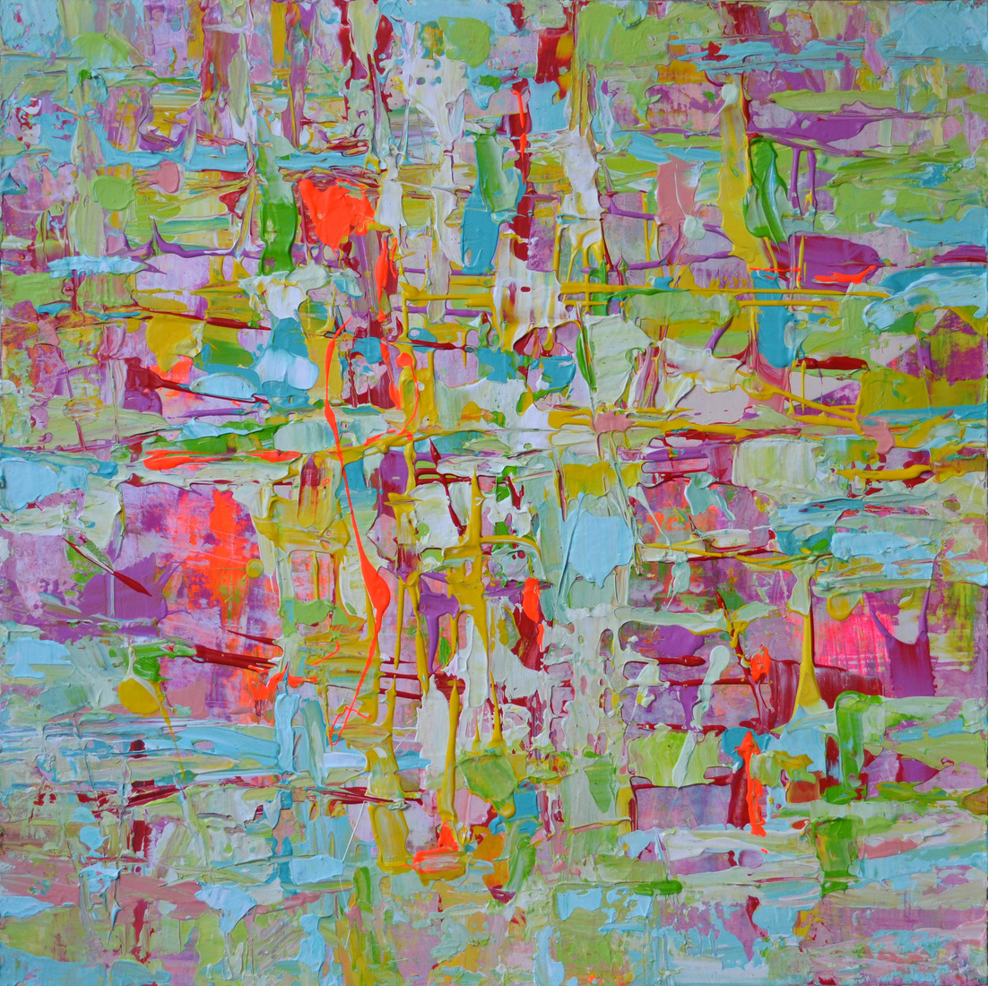
50 x 50 x 4 cm, © 2021,
prijs op aanvraag
Tweedimensionaal | Schilderkunst | Acryl | Op doek
A spontaneous and heavy-textured composition of pastel and primary colours. Blue, the most calming colour, is most likely to give you peace, stability and guidance to hope. The primary colour, yellow produces a warming effect and arouses happiness. The soft green colour, which comes from yellow and blue combined, is essential to adding harmony. Soft pink and purples are enhancing happiness, hope and harmony ultimately leads to more blissful living.